Ten Mistakes To Avoid As A Product Designer
Sharing this with hopes that you don’t make the same mistakes I did.
January 3, 2021
This is not a case study but merely my own personal experience working as a product designer at 2 startups in Jakarta, Indonesia. I’m hoping my experience can enlighten anyone who had just got into the role or is currently pursuing it.
Here are 10 mistakes I made.
1. Saying yes to every design related tasks or request
Being new in the industry and company you might be hesitant when your boss or co-worker asks for your help with a design related matter, after all you are getting paid as a “designer” right?

In most instances, I would advise for someone who is fairly new (especially fresh-grads) to take the extra-mile and find the time to help with these design related tasks/request, even if they are out of your job description (e.g presentation decks, typography in documents etc).
But, please…
If you have tasks that’s been assigned to you by your Lead, Project Manager or whoever it is responsible in assigning tasks to you, THAT should be your top-priority. Keep in mind that you only have a fixed amount of time to complete a task/project, that is why companies pay Project Managers and Lead roles to manage the fixed time that everyone has.
As someone who works in an early-stage startup, I understand that quite often, you may have to utilize your design skills and extend it to other facets of design. This is OK, as long as you are transparent to everyone that are involved in managing you or stakeholders involved in projects (if you have daily updates/check-ins, this is the best time to inform everyone).
Be transparent and let everyone involved know with your day-to-day. This would make it easier to decline requests or adjust timelines if necessary.
2. Underestimating how much time a task needs
 Illustration by absurd.design
At the very beginning of my career, I’ve always wanted to be regarded as someone who is reliable and this translates to “I can deliver it by this afternoon” habit . This is something that is a constant work-in-progress for me up until now. As you gain more experience and master the tools and methods you use in tackling tasks/work, you will definitely spend less-and-less time in delivering a particular task.
Here’s a few examples that are not to be taken literally:
- Designing a button with multiple sizes and states in Figma when you have just started may take you 8 hours.
- Designing a button with multiple sizes and states in Figma after you have learned about auto-layout may take you 4 hours.
- Designing a button with multiple sizes and states in Figma after you have learned about auto-layout, nesting master components properly and variants may take you 30 minutes.
Okay you get my point.
I fell in love with the idea of always underpromise and overdeliver. It might sound like a cliché but it definitely helped me improve for the better.
Here are some key points I did to improve this:
- 1. Always propose double the time that it will take for you to do it (obviously doesn’t apply to all cases, but for uncharted territories such as new features, do it).
- 2. Breakdown your tasks to even much smaller tasks (2–3 hours micro tasks) and update it to stakeholders once a micro task is completed.
- 3. Time track your tasks. I know not everyone will agree with me on this, but for your personal benchmarking, just do it.
3. Not organizing design files and layers properly
This might not sound serious, but it is. For anyone that is a solo designer at an early stage startup or an agency with limited resource to design (you’re pretty much the only designer) you may think:
"well I’m the only one who’s going to see the layers, so who cares"
And that’s true to an extent, for now.
 At least it’s numbered right?
But what happens, when the company you work at decides to scale or the start-up you’re working at is actually doing really well decides to get more resources to help you?
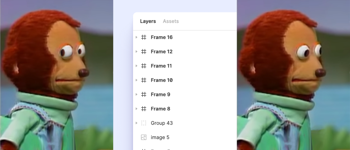
Yep, you’re f*cked now, all those layers named Frame 48 or Group 28 starts to flash before your eyes.
Here are some things I did to improve this:
- Even at my laziest times, always rename it to something that makes sense, at the very least to your self in the future e.g Line to Divider (if it fits the context).
- Force myself to think in components instead of rectangles and frames. I recommend on studying actual design systems instead of articles on it since it may be overwhelming at first. My personal favourite is Atalssian’s Design System.
- Create a Design System. I’m no expert in this particular aspect but this has helped me tremendously in my decision making process and keeping things organized. I recommend reading Elizabeth Alli comprehensive article on Design Systems.
4. Design only for "best cases"
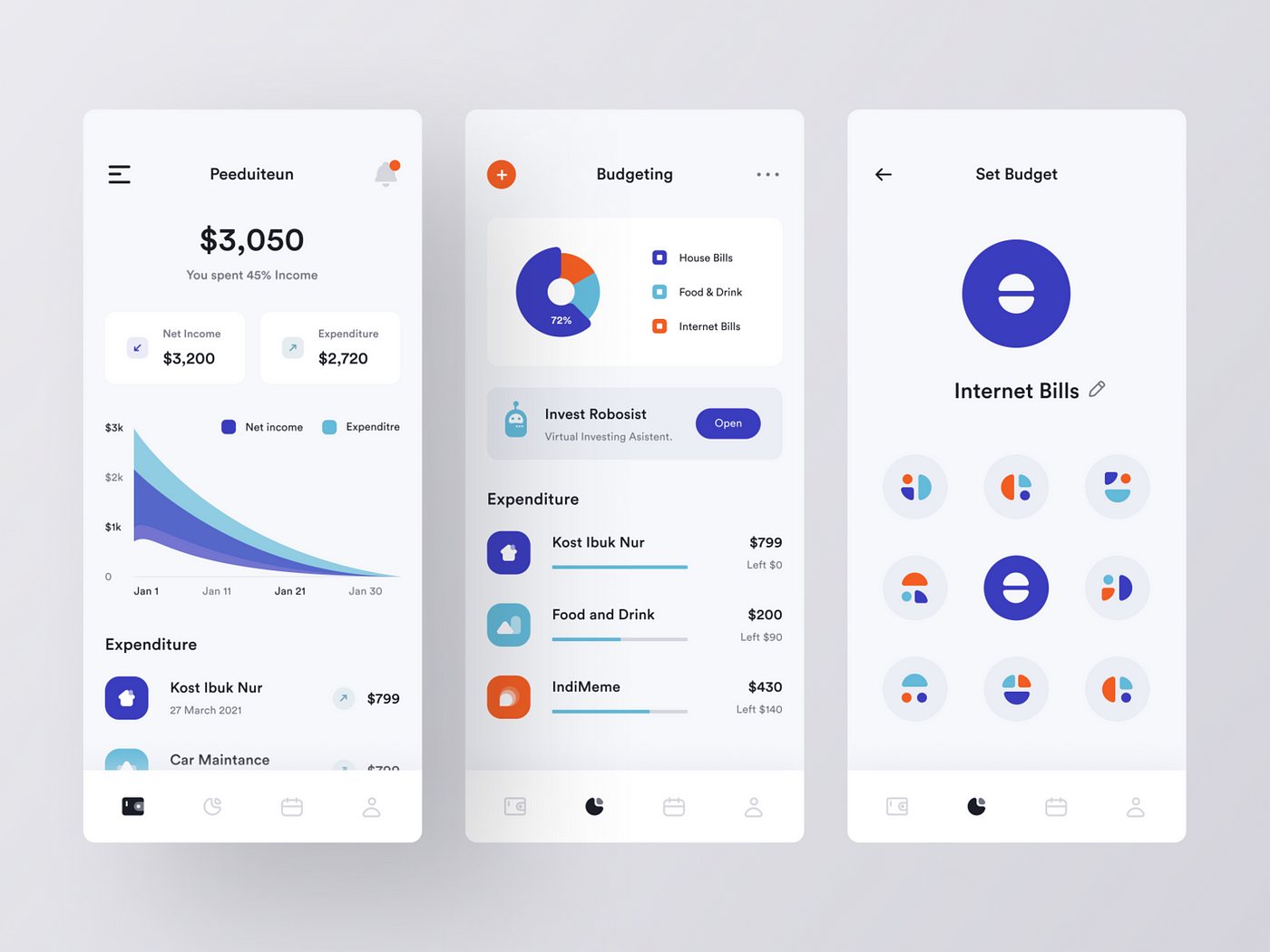 UI exploration by Farhan Fauzan
In the ideal designer’s world, every piece of content is perfect. Everyone’s name has just the right amount of characters to fit in a single-line, everyone uploads their profile picture for an accounting software dashboard and “no internet connection” doesn’t exist.
Okay back to the real world, here are some things I’ve come across:
- People who may use the product you designed may not have the latest tech and fastest connection. This may lead to slower processing speed and more time spent on seeing loading and error states than expected.
- Not everyone opens a website with a perfectly 16:9 or 16:10 ratio, some might open a browser tab with a small window.
- People or companies that use your product may not have the perfect amount of content or data to display.
How I’m tackling this problem:
I’ve been familiarizing myself with edge cases and no, simply creating error states, toast/snackbars and empty states does not qualify as covering edge cases. By all means I’m no expert in this topic, so I suggest reading Jesse Weaver’s article on this matter.
5. Designing with inconsistencies
 Illustration by absurd.design
Okay this might be an extra challenge for those who haven’t invested time in creating a design system. At the very beginning of my career, I was finding myself re-designing the same components a bit too often. Whereas I could’ve save time and stress by re-using the same component that I’ve designed previously (if the use case fits).
But no, I had to design it from scratch and re think of the specs all over again because I am Picasso when it comes to designing buttons.
These are the things that helped me in keeping consistent with my design workflow:
- Have the reduce waste mindset when designing. Think of it when you add more components, you produce more waste, which forces you to design components that are more flexible and more reusable for multiple context and cases.
- Learn and master creating components, auto-layout and variants in Figma. Their team has made these features available so YOU can utilize them.
- Define core elements very early on in the project. Start with your H1, H2 titles, colors and buttons. Keep in mind you don’t have to complete this before starting the project, but at least start so that you can think more systematically.
6. Perfecting over iterating
 Illustration by Pablo Stanley
This is something that applies to most of us. We as designers, naturally aim for perfection and secretly wish that we could spend an infinite amount of time crafting the perfect button. Unfortunately time exists and not just for us, but other people too who don’t particularly care what the hex code is for the blue you have used on the CTA.
By all means always aim for perfection, but the trick is to never achieve it. Remember design is an ever-evolving process and iteration is its dear friend.
7. Not documenting "enough"
 Illustration by Pablo Stanley
Documenting design has always been tricky for me especially when you have just started in a company and was handed-over the design files which only has art-boards/frames of the UI.
This is a constant work in progress up until now for me but I have a list of what I think is the bare minimum on what you should have:
- User flows. Sounds simple but I’ve come across files that doesn’t have this and I cannot imagine how the devs must’ve felt trying to figure out whats going on. Pro tip: I usually do my user flows with the designed screens in Figma using a plugin called Autoflow.
- Prototype preview. This can be done natively in Figma fairly quick, but I usually only do this for your typical happy flow or flows that are linear, whereas much more complex flows with various conditions, user flow should be enough.
- Context/captions for artboards. Renaming frame/artboards is a good start, but while you’re at it why not add a title or header outside of the UI screen to give better context to viewers.
I recommend watching Femke on YouTube showcasing design deck documentation, something I’m yet to apply in my workflow.
8. Over-concerning with technical/engineering constraints
Development has its limitations, there will be a time when your design decisions may not even make it to the final product. You will come across this at least once in your design career and you might not even notice it.
 Illustration by absurd.design
I don’t think we can develop this particular design because of x, could you propose an alternative?
Okay this can happen either because:
- Your design has many flaws and hasn’t taken into consideration of what is possible and what is close to impossible to build.
- Developer finds it to be too complex and would prefer if there was a simpler design to build (the effort outweighs the output).
When this happens, don’t overthink it. Review your work again and try to involve the developer even more.
How I approach this now:
- Open a deeper dialogue between you (the designer) with the other stakeholders (esp. developers) to really find out what is stopping it.
- Try find similar references (this should be done already) and show it to the developer involved, open a discussion on WHY is it possible on the reference you have and try to pick it apart together.
- Ask for suggestions. As long as the goals remain the same, I don’t see why we as designers don’t take suggestions especially from experienced developers (other roles too).
9. Design first, ask questions later
 Illustration by Pablo Stanley
If you ever come across a brief or a task that you sort-of have an idea of what it should look like (you’re literally picturing the solution as you read) you might be tempted to open Figma or whatever tool you use and start pushing some pixels.
Not a good idea…
It’s worth to spend an extra day to define the scope of the brief with all the stakeholders involve.
Make sure they understand every-little-detail as much as you do. Otherwise, you might notice some-things are missing while its being developed and this will be a nightmare to everyone involved.
10. Looking at Dribble as the main source of inspiration
 Illustration by Pablo Stanley
Truly one of product designer’s greatest vices. I for one love dribble, I love how every content is perfect, every photo works with the UI palette, concepts that are out of the box (literally assets outside of the frames).
Don’t get me wrong, the mistake I did was not looking at dribble per se, but it was when its the only source i go to to get inspired was the mistake.
I started to withdraw myself from going to Dribble for the only source of inspiration when I realized that many designers, were in-fact designing only for Dribble and there wasn’t a real product or reason other than “getting the perfect shot”.
I know this doesn’t apply to every designer that posts on Dribble (there are some amazing products and sites that gets published here). I’m only expressing my view from a product designer’s perspective.
If you’re looking to specialize in UI only, then I say go for it, create as much as you can and improve while doing so.
But if you’re looking to solve people’s problems and design actual products, check out my go to websites for inspiration:
So there you go, there are the 10 mistakes (there’s probably more) that I’ve made so far. Hopefully it’s useful for everyone, especially who had just started their journey as a product designer.
Looking forward to making more mistakes :)
Bernie.
Thank you for reading 😄
Our Thoughts, Written Down

